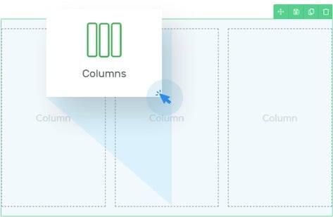
Build Any Column Layout
With the Column element in Shapeshift, you're not limited to a certain number of columns or to a specific division of columns. Add as many columns as you want simply by dragging elements next to eachother.
Easily Nest Columns
On top of being able to make any column layout you desire, you can also nest column elements within column elements. This allows for super advanced layouts.


Decide What Happens on Smaller Screens
Columns look good on desktop, but can become problematic on smaller screens. That's why the column element in Shapeshift allows you to decide whether you want the elements to stack, what's the breaking point and if they should be inverted or not.
Background, Border, padding, margin and Shadow Customization
Any column can get an individual background. This can be a solid color, a gradient, a pattern, an image or any combination of these layered on top of each other.
Any column can get an inner, a drop shadow or multiple shadows at once.
And of course you can add borders and decide on the radius of the corners of the columns.
Adding any element to the Column element is super easy and you can further customize the layout by using the padding and margin options for individual columns or the complete column element.
All of this will give you total design freedom.
Column Hover Effects
On top of all these customization options for the "normal" state of a column, you can also customize them for the hover state. This makes that the column element can become a nice call-to-action element too!
